

Exploring Short Term Profit Per Million And Trader PnL
My colleague David Hall at TAPaaS wrote a great piece a few months ago that I came across and wanted to share. In his article, David asks this critical question: “Is Profit Per Million (PPM) in the first 30 seconds post trade a good predictor of a Traders’ Realized Profit when they ultimately close their positions?”
David’s insight is that the received “wisdom of the crowd” on some key metrics commonly used in the FX trading business are not reliable indicators of positive performance. He uses some data visualizations to illustrate and prove his points.
In my experience, the same holds true in every segment of the Capital Markets business, whether it be equities, fixed income, or futures trading. The way things may appear to be in the typical end-of-day or end-or-period reports are often misleading at best. Likewise, the way certain changes in price, risk, or volatility affect overall outcomes can easily by hidden in aggregated data. The only way to really understand the huge volumes of fast-changing data in use within any trading business is to use the right visual analytics tools combined with a data infrastructure that can handle the data properly, and managed by a team of people who know the right questions to ask.
Full disclosure: TAPaaS is one of our partners. They have incorporated Panopticon data visualizations into their risk management and reconciliation solution for FX brokers.
Here are what I think are the best parts of David’s article. Read the full article here: https://tapaas.com/exploring-short-term-profit-per-million-trader-pnl/
One of the key measures often quoted when evaluating the effectiveness of a Trader’s strategy is their Profit Per Million [in the first n seconds from the time of execution]. Some believe that a Trader who is frequently successful in the first 30 seconds post trade will ultimately make money.
Discovering Insight Through Visualisation
Any analysis must begin with a question which we then endeavour to answer. For example:
Is there a high correlation between a trader’s Average PPM and their ultimate realised profit?
There are many ways to answer such questions or prove theories about the relationship between features of trading activity and the outcomes we are trying to predict, such as profit. These include statistical approaches like linear regression, machine learning techniques or exploring with visualisation.
All of these are appropriate at some point. I generally like to start with visualisation before investing in application of the other techniques as they can be expensive to implement. It is quite amazing how the human mind can grasp complex relationships and patterns if they are presented visually.
In this question, the outcome we are interested is the Realised Profit, the feature we are evaluating is Average PPM. We’d like to discover if and when there is a correlation such that PPM can be used as a predictor of Realised Profit outcomes.
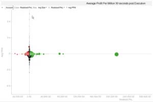
Scatter Plots Are Great For Visualising Correlation
There are many available chart types to visualise data. Below we need to display the relationship between PPM and Realised PnL by Trader. Scatter Plots are perfect for identifying relationships between several features and outcomes at the same time. This chart presents Realised PnL across the horizontal axis and average PPM across the vertical. Out of interest, I was also curious about the average size of the trades, so I’ve use the size of the bubble to depict USD equivalent size of trade. For a bit more clarity, I’m using colour to depict the Realised PnL as well.
Clustering In Quadrants Shows Correlation
Generally, if there were a strong correlation between the factors being measured on the X and Y axis, we would see a cluster or cloud of bubbles in at least one of the quadrants or spanning diagonally between two quadrants of the Scatter Plot. For example, if high PPM meant high Realised PnL, there would be a big cloud in the upper left quadrant ( the Realised PnL is in broker perspective ).
As you can see, the bubble are clinging to the axes which is indicating that PPM in the first 30 seconds post trade is not highly correlated with realised PnL of the trader.
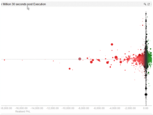
Zoom In If You Want To Learn More
To explore this more deeply, we can zoom in to a section of the plot that we are interested in. I am most interested in the Traders that are making money off me. That is the ones on the left.
Drawing Insights From Findings: What Does It All Mean?
One finding above is there is not a big correlation between Average PPM and the Realised PnL by Trader.
But, before you walk away, to get Insight, you need to ask yourself: Is that enough? Are we finished here? Do I see anything else here?